← All work

When the conditions are right.

A self-initiated wealth app concept, built around one question: when someone else manages your money, when should the product earn your attention?

Type
Self-initiated concept
Sector
Consumer wealth, advised
Built with
Lovable, AI-accelerated
Year
2026
Covers
Wealth, goals, messaging, advice
Status
Not shipped. Live to try →
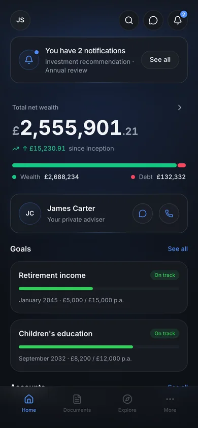
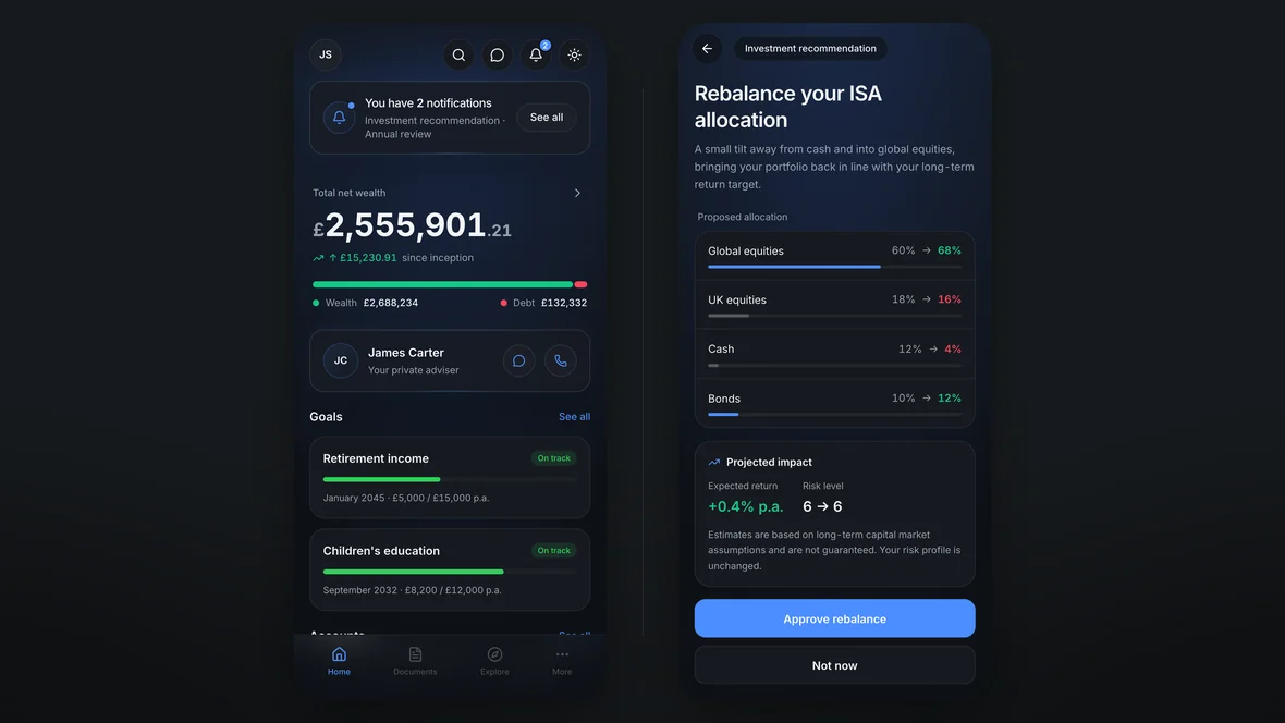
Two screens side by side. On the left the calm home screen: one summarised notification, total net wealth, the adviser, two goals. On the right the one screen that asks for a decision, an ISA rebalance with current and proposed allocations and an approve action.

TLDR

An advised client is not a trader. They check in rarely, they delegate the decisions, and the moments that genuinely need them are few: a recommendation to review, an annual review to confirm, a change to approve.

Yet most wealth apps borrow their density from trading platforms. So this one is built on two rules. Calm by default, one holistic view that reads in seconds. And attention only when it’s earned, asked for clearly, once, then out of the way.

When someone else manages your money, when should the product earn your attention?

01

Why this exists

My client engagement at the time was a study in restraint. A complex, multi-stakeholder platform where the right senior call was to hold the lo-fi line and design the conditions for the work before the craft. I stand by those decisions and I wrote about them in the client portal case.

But years in wealth left me with a problem I wanted to answer on my own terms. Not the no-constraints version, which is a playground. One specific question the industry keeps getting wrong.

The problem

An advised client delegates. They are not checking positions daily and they did not ask to spend attention on charts, tickers and red numbers competing for it. Most wealth apps hand them a trading platform anyway, because that is the density the category inherited.

The question is not how much you can show. It is what has earned the right to interrupt.

02

Attention, spent only when earned

The notification pattern carries the thesis, and it is a behaviour rather than a layout.

A compact banner summarises, “you have 2 notifications”, instead of stacking task cards over the financial snapshot. Tapping it opens a bottom sheet. Each row can be dismissed, or expanded into a detail view sized to its weight: a richer flow for an investment recommendation with the proposed allocation laid out for review, a lighter one for confirming a meeting.

Resolve everything and the banner does not show an empty state. It disappears. The unread count stays consistent across the bell, the banner and the sheet, because trust in a financial product is partly trust that the product agrees with itself.

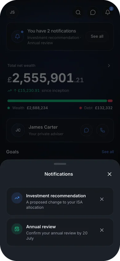
The notifications sheet open over a dimmed home screen: two rows, an investment recommendation about an ISA allocation change and an annual review to confirm, each with its own dismiss control.
Summarise, expand on demand, then disappear Two rows, each sized to what it is asking for. When the work is done the banner does not congratulate you on an empty inbox. It leaves.
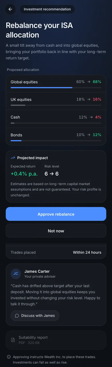
The allocation rebalance in full: four asset classes moving from current to proposed, global equities 60 to 68 per cent and cash 12 to 4; projected impact of plus 0.4 per cent a year with the risk level unchanged at 6; approve and not now; the adviser's reasoning in his own words with a route to reply; a suitability report; and a line stating that approving instructs the firm to place the trades.
The heavier row, expanded An investment recommendation gets the full treatment, because this is the one moment that genuinely needs the client. Current and proposed sit side by side, and the projected impact answers the question a client actually has before they have to ask it. Not what will I earn, but am I taking more risk: risk level 6, unchanged, sitting next to the return. Then the adviser's reasoning in his own words with a route to reply, and a plain line saying that approving instructs the firm to trade. Green up, red down, and the bar fills blue as a holding grows and grey as it shrinks. No direction here rests on colour alone: the two percentages state it and the bar length shows it, which is a colour rule doing a job on screen instead of in a style guide.

The trade-off I would rather name than hide

Summarising risks burying something time-sensitive behind a headline. Whether the calm is worth that cost is a research question, not a taste question, and it is the first thing I would test with real users.

The part that does not survive as a still image is the behaviour itself: rows dismissing with a count that updates everywhere it appears, a row expanding into its detail and back. I built and refined it as a working prototype, because a notification pattern is a behaviour and behaviours cannot be judged in a screenshot.

The behaviour, not a picture of it Dismiss a row and watch the count fall everywhere it appears. Resolve both and the banner leaves rather than congratulating you. That is the whole argument of this section, and it is the part a screenshot cannot make, so here it is running instead.

03

Calm is not the same as shallow

The risk with designing for calm is that it becomes an excuse for showing nothing. So the home screen is a summary with the whole thing one tap behind it, not a summary instead of the whole thing.

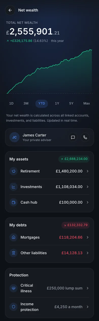
Net wealth in full: a performance chart with six time ranges, the adviser, then assets across retirement, investments and cash carrying a green total, debts across mortgages and other liabilities carrying a red total, and a protection section listing critical illness cover and income protection.
Everything the home screen is protecting you from The performance chart, six time ranges, and assets and debts each carrying their own total so the two sides can be read against each other at a glance. Protection sits with them, because an adviser taking stock of your position counts the cover you hold as well as the money. This is the density an advised client does not need on a Tuesday, which is exactly why it lives one level down instead of on the front page. Restraint only reads as a decision when you can see what was held back.

One inbox, filtered

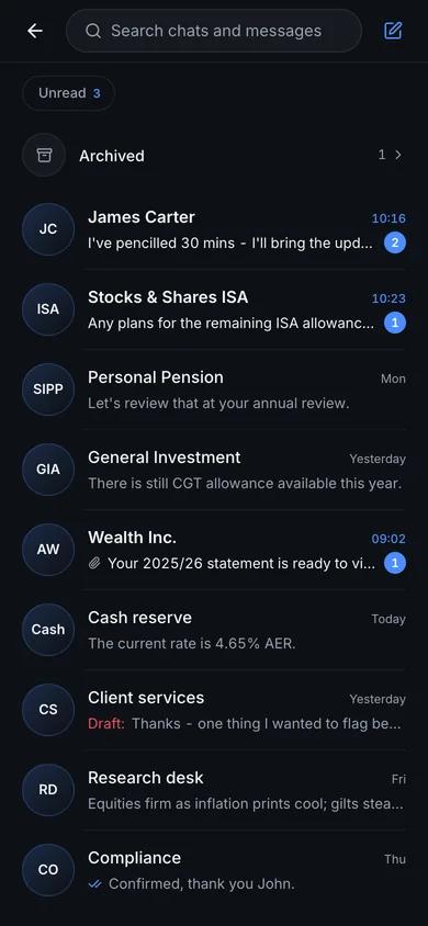
Adviser messages, firm updates, research and compliance all land in one filtered space instead of separate areas for messages and notifications. Anything needing a reply is a thread, not an alert.

The secure messages inbox: search, an unread filter, an archived row, then threads from the adviser, from four accounts, and from client services, research and compliance, with unread counts, an attachment and an unsent draft.
The argument I lost slowly, built properly On the client portal I spent real advocacy getting messaging and notifications consolidated into one filtered space, against stakeholders who wanted two. This is that pattern with the craft on it: unread state, drafts, attachments, senders that span adviser, firm and compliance. Threads belong to accounts as well as to people, so a question about the ISA lives with the ISA rather than in a pile sorted by whoever happened to send it. Same call, made twice, once under pressure and once on my own terms.
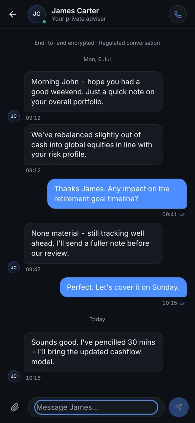
A thread with the adviser, labelled end-to-end encrypted and a regulated conversation, showing a rebalance explained, the client asking about the retirement goal, read receipts, date breaks and a composer that takes an attachment.
A thread, not an alert One line sits above the first message: end-to-end encrypted, regulated conversation. In advised wealth this is a record rather than a chat, and saying so at the top costs a single line and answers a question the client would otherwise have to ask someone. Under it, the ordinary things done properly. Read receipts, presence on the adviser, date breaks, and a composer that takes an attachment, so replying is as easy as the alert was to receive.

04

The system underneath

Colour as a reserved vocabulary

In an advised product the one thing a client must never misread is the direction of money. So colour is treated as a governance rule, not a palette. Green and red speak only about money: wealth and gains, debt and losses. The brand blue speaks only about what you can touch: buttons, links, active states, progress. Neither vocabulary ever borrows from the other.

The test of whether that’s a system or just a style is whether it survives theming. It does, and you can check: the prototype above has a light theme behind the control in its header.

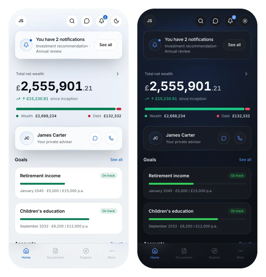
The same home screen side by side in light and dark, from one build. Green still marks wealth and red still marks debt in both, blue still carries the primary action, and every value has changed while no role has.
One screen, one colour system, two tones The rules hold and the values do not. Not one accent survives the move: the dark green is 2.2:1 on white, the dark blue 3.2:1, so all eight had to be replaced. What did not change is what any of them mean. Green and red still speak only about money, blue is still the only thing you can press, and nothing swapped roles to suit the background. Every light value was set against a contrast target and then checked on the rendered page rather than in a swatch.

The quiet craft

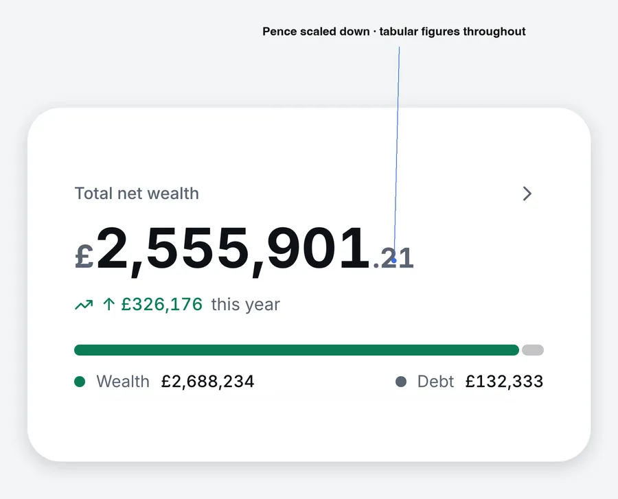
Finish supports the thinking. It doesn’t stand in for it. A balance is the hero of its screen, so the pound symbol and the pence step back in size and colour and the amount takes the focus. Every figure is set in tabular numerals so columns and counts align. Labels are sentence case and quiet. One typeface, generous space.

An annotated zoom on the total net wealth figure, showing the pence scaled down and the currency symbol lightened.
The amount takes the focus The currency symbol and the pence step back so the number reads first. Small, and the difference between a figure you scan and a figure you have to parse.

05

What I said no to

The refusals shaped this concept as much as the additions did.

No performance charts on the home screen, because an advised client scanning for reassurance does not need a candlestick. No feed, no market news, no gamified streaks, none of the mechanics that manufacture engagement a delegating client never asked for.

And the adviser stays persistently on the home screen, one tap from a message or a call, because an advised client is buying a relationship, not a terminal. The product should behave like it knows that.

The home screen in the light theme, with the adviser card sitting directly under the wealth summary and above the goals.
The adviser is not buried in a menu A named person, one tap from a message or a call, on the screen you land on. Everything the refusals removed is space this could occupy.

06

What this is, and where I’d take it

To be clear about what this is: an exploration, not a shipped product. No launch metric, no user base. What it offers is the thinking and the craft where you can see both, next to the shipped record the other cases carry.

I used Lovable to render and iterate quickly, which is how I work day to day. AI to accelerate exploration and cover more ground, my judgement on every decision and on the bar for quality. The attention model, the colour vocabulary, the refusals: each is a call I can walk you through and defend.

Where it goes next is the trade-off at the centre. Does summarising reduce noise without delaying time-sensitive actions? I would measure time-to-action on notifications against a conventional stacked pattern before trusting my own design. After that, motion: a balance that counts up on load, a chart that draws itself in, transitions that make a financial product feel calm rather than busy.