← All work

When the conditions aren’t right, design the conditions.

A configurable SaaS client portal across 8 product areas and 60+ screens, and the alignment work that made designing it possible at all.

Client
FNZ
Sector
Wealth management
Role
Senior product designer, sole UX
Year
2025
Status
Delivered to signed-off direction
The client portal dashboard held in one hand, showing total net wealth and goals at a glance.

TLDR

I joined as the sole UX designer on a configurable SaaS wealth portal with a seven-month clock, and a brief that had a vision but no alignment. Six-plus product owners across two organisations, no personas, and a word, “SaaS”, that meant something different every time it was said.

So before I could design the product, I designed the conditions for it. I pulled every debate back to one question, built the shared tools the teams were missing, and defended three decisions with data and precedent.

The hardest thing to design here wasn’t a screen. It was agreement on what we were building.

01

The brief, and what it actually contained

A centralised portal giving advised clients a holistic financial snapshot across pensions, mortgages, investments and ISAs, aggregated from multiple providers into one view. Configurable SaaS, built once, adaptable across future clients. Mobile-first. Seven months.

What the brief didn’t contain was alignment.

The vision was high-level and lightly documented. Stakeholders across two organisations, internal SMEs, six-plus product owners, a senior sponsor and an external client, held strongly differing views on what the product should be. Some pushed for older patterns: horizontal nav, dense landing pages, separate spaces for messaging and notifications. The client’s expectation started drifting toward bespoke almost immediately.

No formal personas. Fragmented requirements. A commercial timeline where delay had a direct cost. The design problem and the organisational problem weren’t separable, so I worked them together.

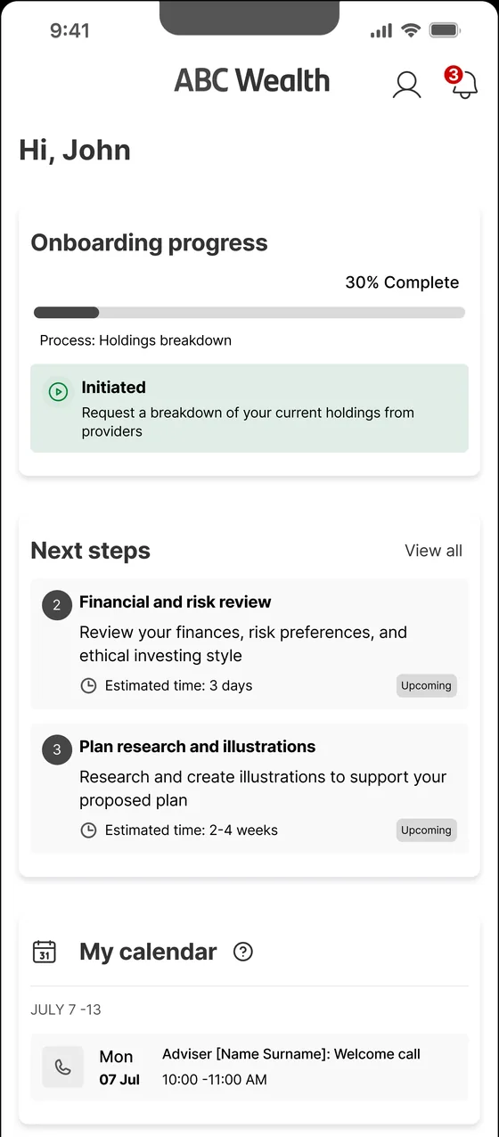
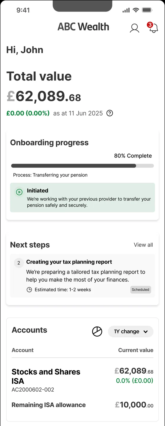
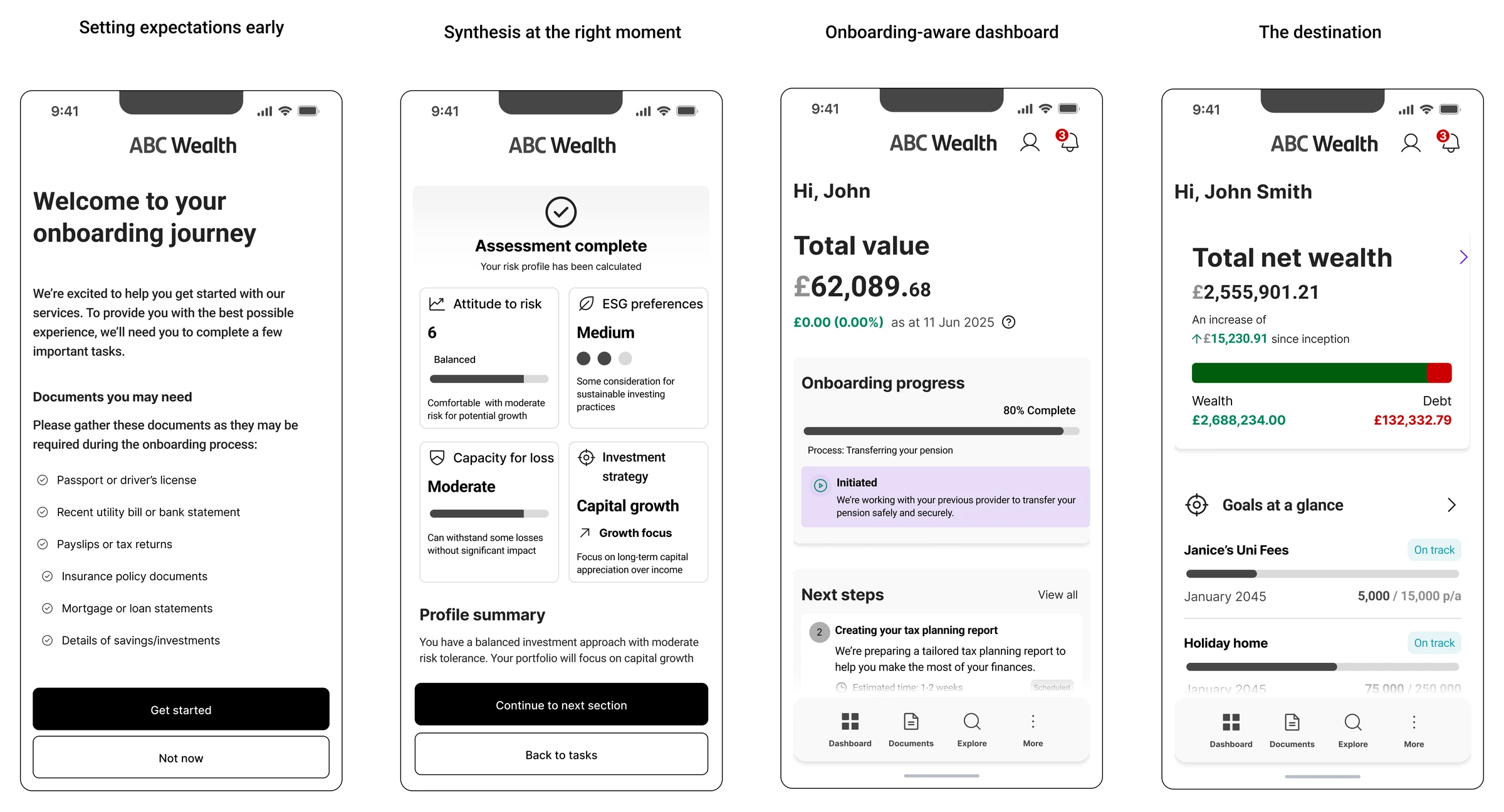
Four onboarding screens: setting expectations early, synthesis at the right moment, an onboarding-aware dashboard, and the destination.
Onboarding flow, lo-fi Guides advised clients through setup, surfacing key tasks and establishing their financial profile before they ever hit the dashboard. Expectations are set on screen one, on purpose: this journey asks for documents most people have to go and find.

02

The decisions that mattered

Three foundational decisions, made early, held the rest of the work together.

Mobile-first, defended with data

Complex financial information is harder at mobile scale: less room, no tolerance for clutter. But 70% of the client’s existing users were on mobile. Stakeholders were focused on the web portal and largely dismissive of mobile. The usage data is what made the priority defensible.

Lo-fi, held against pressure to go hi-fi

Across 15+ review sessions the push was to see UI direction sooner. I held the lo-fi line, because the conversation we needed was about flow and function, not aesthetics. Show polished visuals too early and the conversation shifts. I needed it not to.

Simplification grounded in precedent

From 30+ user stories across 8 product areas, two calls show how I made them.

Messaging and notifications, proposed as two separate areas

Modern platforms consolidate: one inbox, filtered by type. I proposed a single Secure Messaging space covering adviser comms, system messages and firm info, with notifications demoted to settings and onboarding tasks surfacing on the dashboard but living here.

It took real advocacy to land. Two separate spaces is an old habit and a comfortable one, and neither of those is a reason.

Documents, proposed as a personal cloud vault

The stories pointed at a OneDrive equivalent. From a previous role where that pattern saw near-zero adoption, I pushed back: users don’t trust financial platforms with personal files, and they already have tools for that.

I scoped it to what it needed to be, receiving and managing adviser documents and uploading in response to a request, and removed the tangled sharing-permission logic. If you’re uploading in response to a request, the upload is the permission.

These weren’t aesthetic calls. They were the boundary between a coherent SaaS foundation and a feature-heavy product nobody needed.

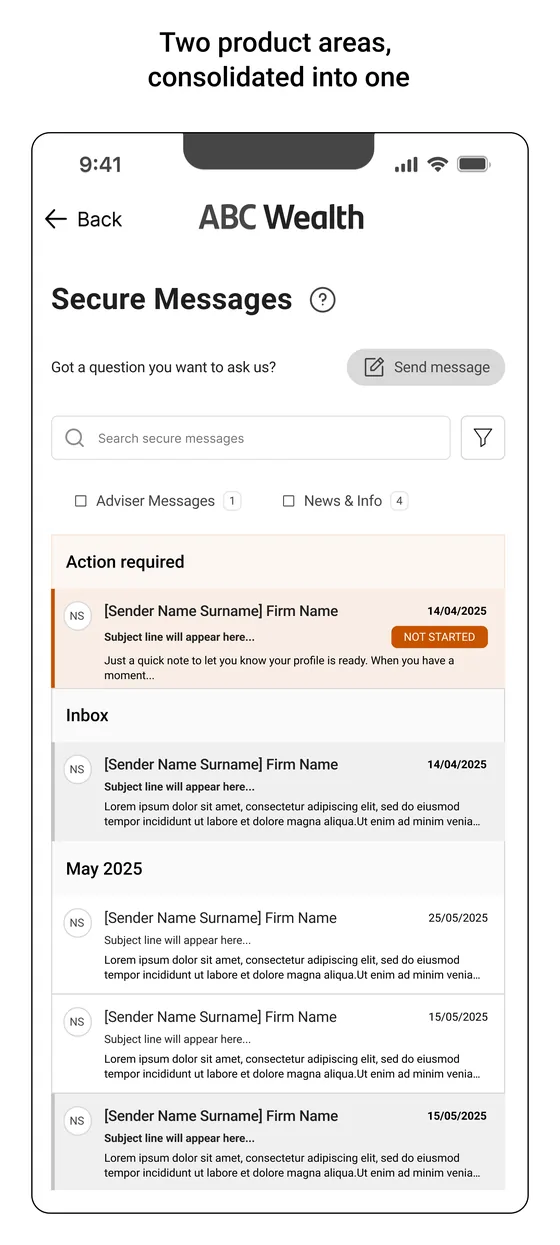
Secure Messages screen with a single filtered inbox, an action required group at the top, then the inbox grouped by month.
Two product areas, consolidated into one One filtered inbox replaces the two separate spaces in the original stories. Anything needing the client sits in Action required at the top with a status, so the thing that needs doing is never buried under the thing that does not.
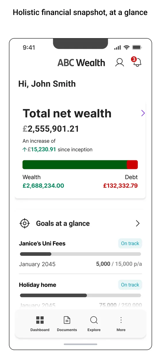
Dashboard wireframe showing total net wealth, a wealth against debt bar, and goals at a glance.
Holistic snapshot over feature-heavy layout Aggregated wealth across providers, readable at a glance. The wealth against debt bar answers “how am I doing?” before the reader has to parse a single number.

03

Designing the conditions for the design

The work I’m proudest of here isn’t in the wireframes. It’s in what had to be true before anyone could draw one.

I reframed the conversation

Early sessions were noisy: strong opinions, deep expertise, no shared anchor. Instead of gathering more views, I pulled every debate back to one question, what problem are we solving for the end client? That became the lens for every decision and the way I navigated competing positions for the rest of the project.

Every walkthrough started with the journey

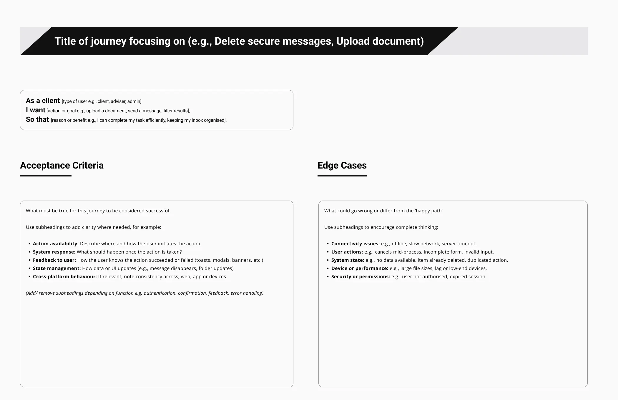
Sessions kept derailing into reactions to individual screens, so I built a journey-mapping template and led each review with the intent of the journey before a single wire went up. Feedback stopped being about what a screen looked like and started being about whether the journey held. That stuck for the dozen-plus sessions after it.

The shared workspace neither team had

A collaborative Figma space both teams could see in real time, FigJam for discovery, and design documentation in Confluence: a template and a process for capturing the thinking, not just the output. As a new joiner on an undocumented project, I felt that absence acutely.

I built a Copilot documentation agent

Manual documentation doesn’t scale across a growing team, so I built an agent that turns a short conversation into a structured design record. It started as a fix for my own problem, and I shared it with selected members of the design team to try. The longer story is in the AI lab, including the part where a useful tool did not create a documentation habit.

None of this was in the brief. All of it was necessary.

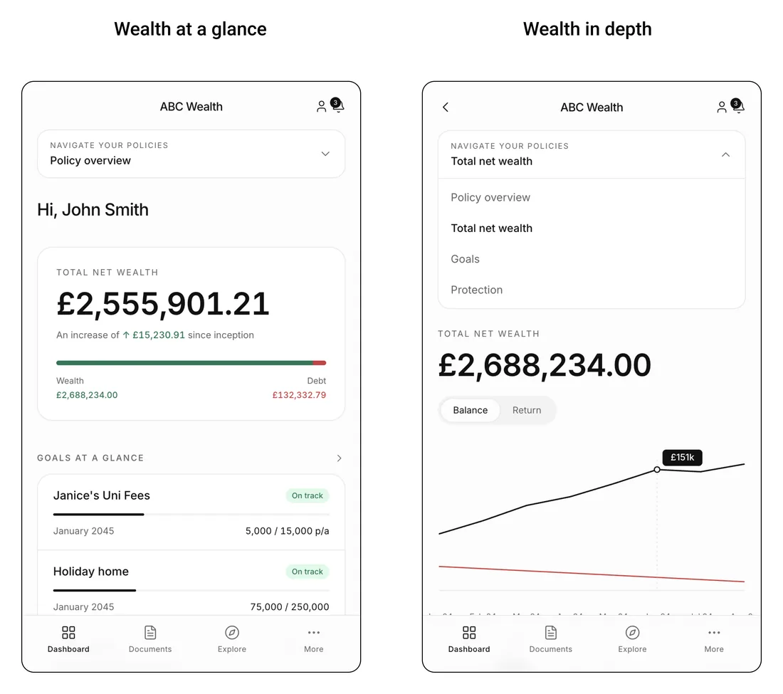
Two dashboard concepts side by side, wealth at a glance and wealth in depth, rendered at higher fidelity.
Concept visualisation, rendered in Lovable Built from the lo-fi wires to communicate direction at higher fidelity without breaking the lo-fi feedback discipline. The same screen shown at two depths, because “at a glance” and “in depth” are different jobs and the argument was about whether one view could serve both.

04

The outcome

  • 60+screens
  • 8product areas
  • 7months
  • 1designer

Structured, documented, and taken through to a signed-off design direction, ready to move into high fidelity.

That sign-off is the thing I was actually hired to get. A brief with no alignment, six-plus product owners and no shared definition of the product, turned into one agreed direction the business could build on. It exists now as an internal core product: a configurable SaaS foundation the business can demonstrate to future clients. The Copilot documentation agent outlived the project too.

And the honest part: it never reached high fidelity. The engagement paused at the phase boundary, because the gap between our SaaS brief and the client’s expectation of a bespoke build never fully closed, and they took the design work in-house. The direction was signed off. The visual craft on top of it is the part I didn’t get to do here, which is exactly why I went and did it on my own terms next.

05

What I’d do differently

Make one thing non-negotiable: the alignment workshop. I tried more than once to get every key stakeholder into a shared space to agree a single direction before design began, and couldn’t get the organisational buy-in. That workshop was the unlock.

Next time it goes in the plan as a prerequisite, before anything else is scheduled. Alignment isn’t something that happens around the design work. It’s a design problem in its own right, and a senior designer’s job to own.