← All work

Advised wealth app

When the conditions are right.

Type
Self-initiated concept
Sector
Consumer wealth, advised
Built with
Lovable, AI-accelerated
Year
2026
Covers
Wealth, goals, messaging, advice
Status
Working prototype. Try it live →
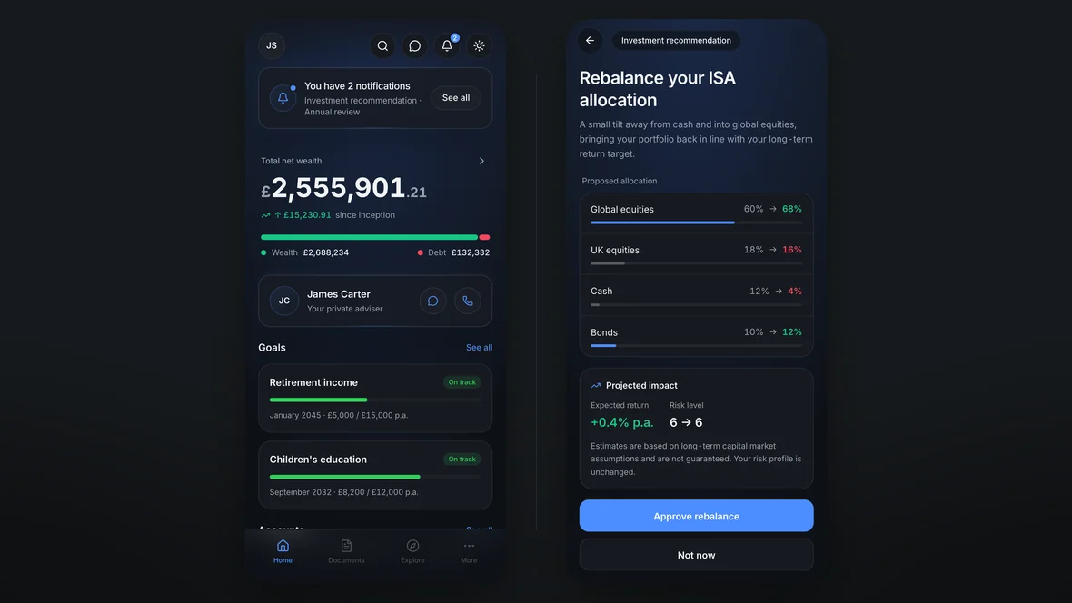
Two screens side by side. On the left the calm home screen: one summarised notification, total net wealth, the adviser, two goals. On the right the one screen that asks for a decision: an ISA rebalance with the adviser’s reason first, current and proposed allocations, and approve, not now or decline.
Self-initiated concept: the calm home screen and the one decision

TLDR

Wealth Inc is a fictional, self-initiated concept for advised clients. I designed and built a working prototype around occasional attention and accessible financial detail.

01

Asking for attention

The app asks for attention, then gets out of the way.

A compact banner opens a notification sheet. Recommendations expand into allocation comparisons, risk and the adviser’s reasoning; meeting confirmations need less detail. Counts stay consistent across the inbox, banner and sheet. Nothing that needs a decision can be swiped away: Not now keeps it, and anything that closes it sends the adviser an answer. Resolve everything and the banner disappears. I built the behaviour in a working prototype because a still image cannot show whether answering, deferring and returning hold together.
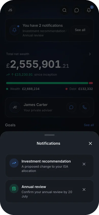
The notifications sheet open over a dimmed home screen: two rows, an investment recommendation about an ISA allocation change and an annual review to confirm, each opening to the decision it asks for.
Notification sheet with two rows, each opening to its decision
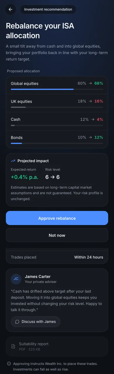
The allocation rebalance in full: first the adviser’s reason in his own words with a route to reply; then four asset classes moving from current to proposed, global equities 60 to 68 per cent and cash 12 to 4; projected impact of plus 0.4 per cent a year with the risk level unchanged at 6; £9,234 to be rebalanced with no dealing fees; a suitability report; a line stating that approving instructs the firm to place the trades; and last, approve, not now and decline.
Investment recommendation showing allocation changes, risk and adviser reasoning
Working Wealth Inc prototype with counts shared across inbox, banner and sheet

02

Keeping the detail available

Financial detail stays one tap away, with the adviser close by.

The home screen offers a snapshot; performance, assets, debts and protection live underneath it. Messages share one filtered inbox, with account-linked threads for replies. I left charts, market news and engagement mechanics off the home screen because a delegating client has not asked for a trading terminal. That leaves room for their adviser, one tap from a message or call.
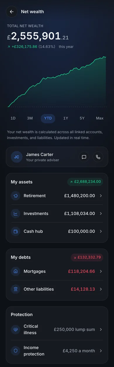
Net wealth in full: a performance chart with six time ranges, the adviser, then assets across retirement, investments and cash carrying a green total, debts across mortgages and other liabilities carrying a neutral total, and a protection section listing critical illness cover and income protection.
Wealth detail showing performance, assets, debts and protection together
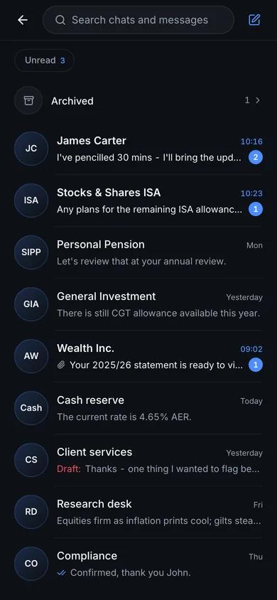
The inbox: search, and filters for all, needs action and unread. Two items needing action come first, a recommendation and an annual review, both from the adviser. Then conversations, newest first: the adviser, four accounts with him named as the sender, and the firm’s teams, with unread counts, an attachment and an unsent draft.
One inbox: actions first, then conversations newest first
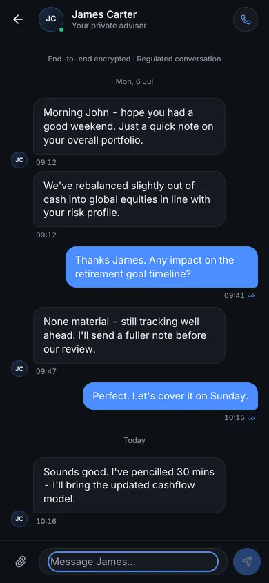
A thread with the adviser: he flags a recommendation and says nothing changes until it is approved, the client asks about the retirement goal, and they agree to cover it at the review. Read receipts, date breaks and a composer that takes an attachment.
Adviser conversation showing read receipts, attachments and a reply composer
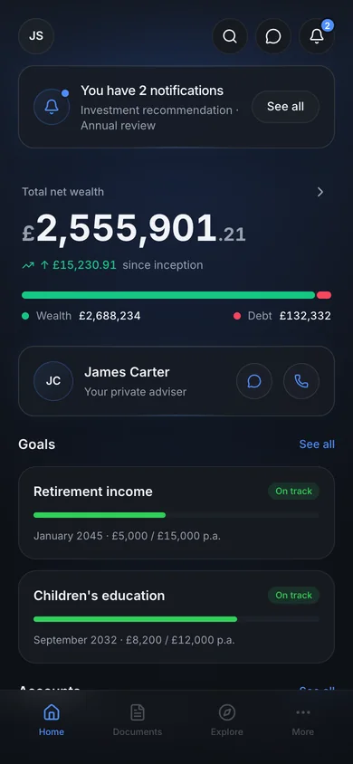
The home screen in the light theme, with the adviser card sitting directly under the wealth summary and above the goals.
Light-theme home screen with adviser contact above savings goals

03

Giving colour a job

Colour separates money from actions in both themes.

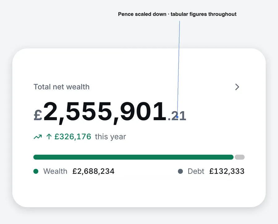
Red is kept for a real loss: a return or a price that fell. Debts, costs and planned reductions stay neutral, unlike my FNZ lo-fi, because a red mortgage on every screen teaches people to ignore red. Green marks wealth and gains, amber a gap that needs attention, blue controls and active states. Percentages and bar lengths also show allocation changes, so direction never rests on colour alone. Light mode needed new values, checked against contrast targets, with the same meanings. Tabular numerals align figures; smaller currency symbols and pence let the amount read first.
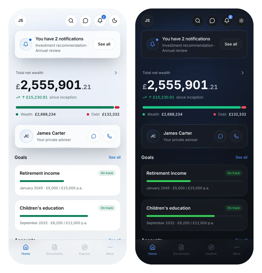
The same home screen side by side in light and dark, from one build. Green still marks wealth and debt stays neutral in both, blue still carries the primary action, and every value has changed while no role has.
Wealth Inc dashboard in light and dark colour themes
An annotated zoom on the total net wealth figure, showing the pence scaled down and the currency symbol lightened.
Balance typography with smaller currency symbol and pence beside pounds

04

Testing the central trade-off

The first test is whether calm hides something urgent.

Summarising notifications could hide something time-sensitive, so that is what I would test first: time-to-action against a conventional stacked pattern, before trusting the calm. Lovable let me render and iterate quickly; the attention model, colour rules and quality calls were mine. Motion comes later. The question that matters is whether the attention model works for real clients.