TLDR
I built this site like a product: brand guide, then design system, then pages. On mobile every page scores 100 in Lighthouse for accessibility, and axe finds no WCAG 2.2 AA failures. I render and measure before I trust a value.
01
Giving coral the room
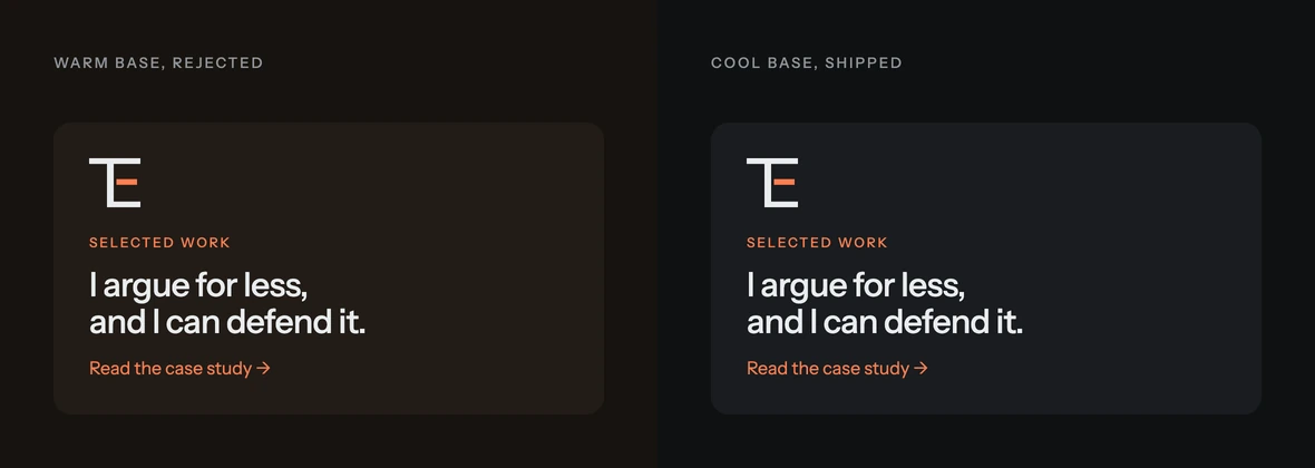
Pulling the base cool made coral the only warm thing on the page.
The first dark base had a brown undertone, and beside coral it read 1970s. Cooling it left coral as the one warm colour. Teal is a guest inside case studies, and no view gets more than two accents.
02
Drawing a mark that survives small
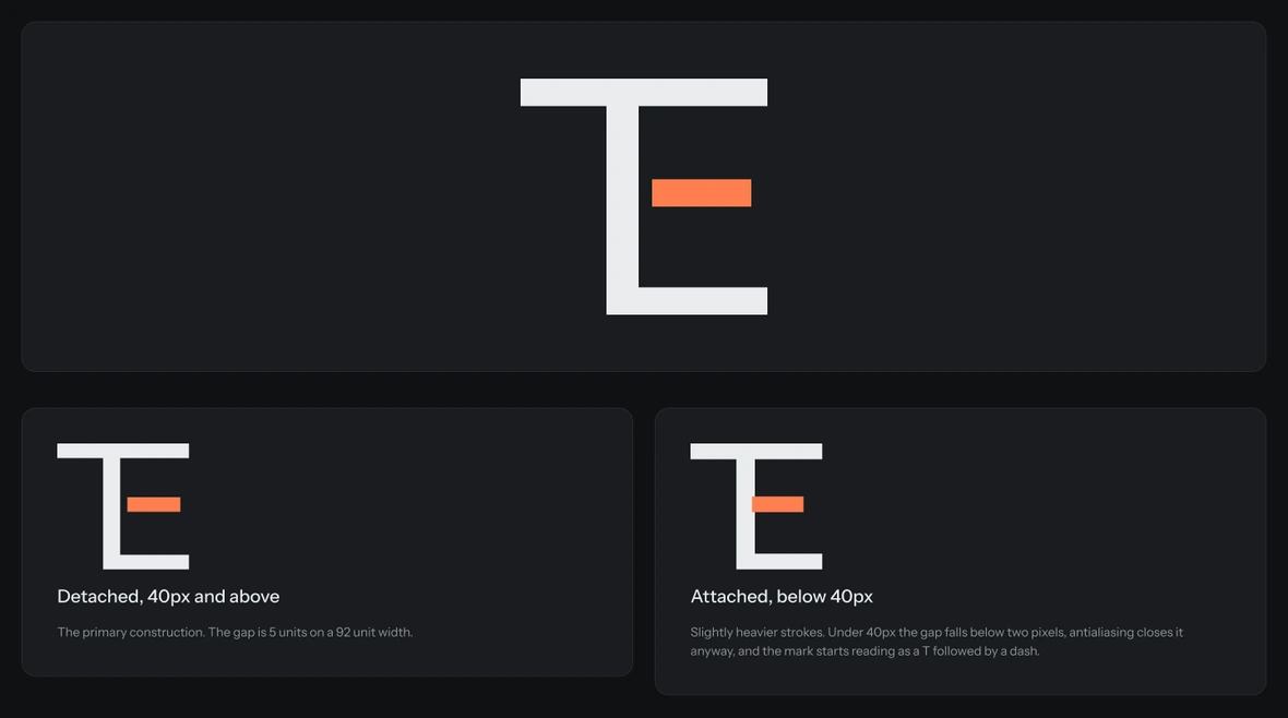
The mark changes construction below 40px, because rendering showed where it broke.
T and E share one stem; the coral middle arm floats free. Rendered at real sizes, the arm read as a stray dash, so I widened it and closed the gap. Below 40px the gap still falls under two pixels, so the small version attaches it.
03
A system you can’t misuse
Raw colours are hidden, so the only thing anyone can pick is a colour with a job.
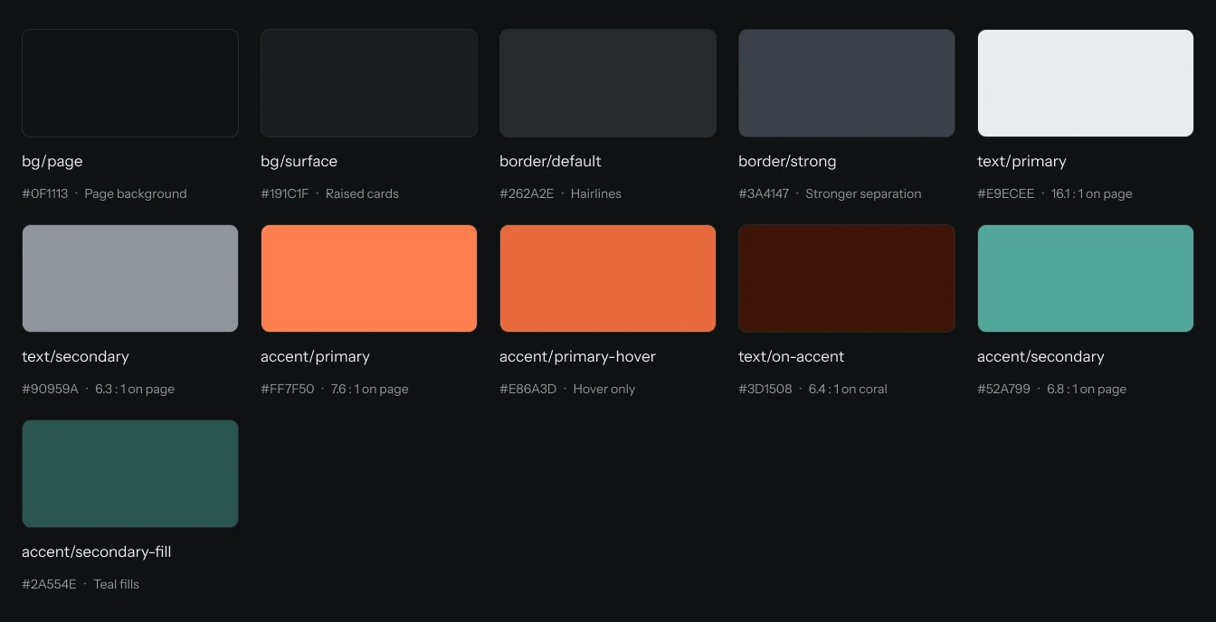
The Figma library holds 48 variables, 10 text styles and 18 components. The first estimates put coral at 7.8:1 and teal at 7:1; measured, they’re 7.6 and 6.8, which drops teal below AAA. In Figma the raw palette is hidden from publishing, so anyone reaching for coral gets accent/primary, though so far that’s only been me.
04
Why a check beats being careful
Being careful kept failing, so a script now checks the guides against the build.
Four documents and a Figma copy describe this build. In one day, six claims were stale in one copy and right in another. Now a check runs before every commit. Claude wrote the script; deciding what counts as wrong was mine. I broke the first five rules on purpose.
| Result | Check | What it found |
|---|---|---|
| drift | Claims corrected, in pages and sources | A source document still carried an adoption figure I had already taken off the page |
| drift | The Figma copies, against their last sync | The Figma brand guide said ten social cards; the build had eleven |
| ok | Eight other checks | Facts, links, paths, em dashes, colours, cut phrases, section status, the skill copy |
05
The numbers
Measuring found two problems, and fixing them didn’t cost the intro.
- 100accessibility, all 13 pages
- 0WCAG 2.2 AA failures in axe
- 99+mobile performance
The first run scored the home page 74: the hero drawing was a megabyte of vector. As WebP from the same file it’s 66KB and looks identical, and the page scores 99 with the intro still playing. axe caught one table a keyboard couldn’t reach on a phone. Fixed.