From the 2019 design file
TLDR
Anything that changed about an FNB customer meant a branch visit. I led the workstream that moved it into the Banking App: 13 use cases, from personal details to tax residency to a document vault. Eight were live while I was there.
01
The loop
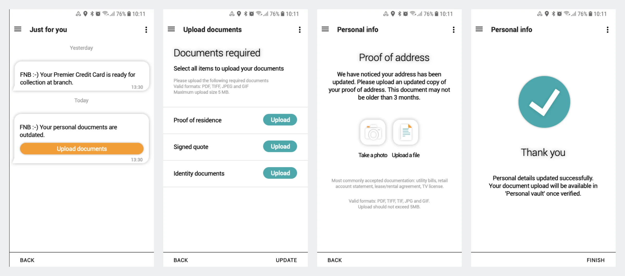
A missing document became a message, a list, an upload and a verified file.
A new surname or a lapsed FICA document meant a branch, a queue and a consultant retyping what you already knew. Here the bank told you in the app what was outstanding. The message opened a finite list, one upload per document, by photo or file, then a plain promise: it lands in your vault once verified. No state was hidden.
02
Compliance as progress
A reward turned a regulator’s demand into something worth finishing.
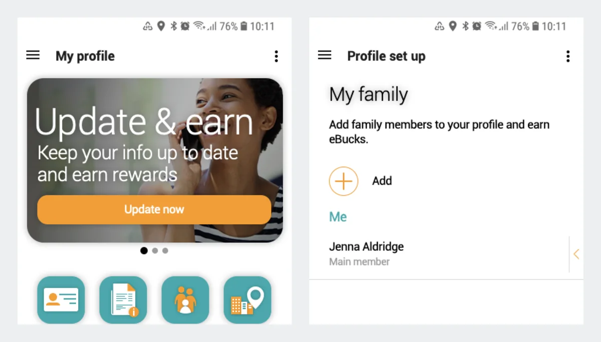
Compliance is usually a stick: miss a document and your account is restricted. The design leaned the other way. A profile-strength meter showed how complete you were, and keeping details current or adding family earned eBucks, FNB’s rewards currency.
From the 2019 design file
03
The result
Eight areas went live, and nothing measured whether branch visits fell.
- 13use cases designed
- 200+screens
- 8areas live
Personal and regulatory details, family, the vault, work info, activity history, a to-do list and preferences. We designed against branch visits and never agreed how we’d count them. Next time: a baseline of branch volumes and time to compliance before the first screen.
04
The vault, honestly
People hesitated to give their bank their documents, and I took that to FNZ.
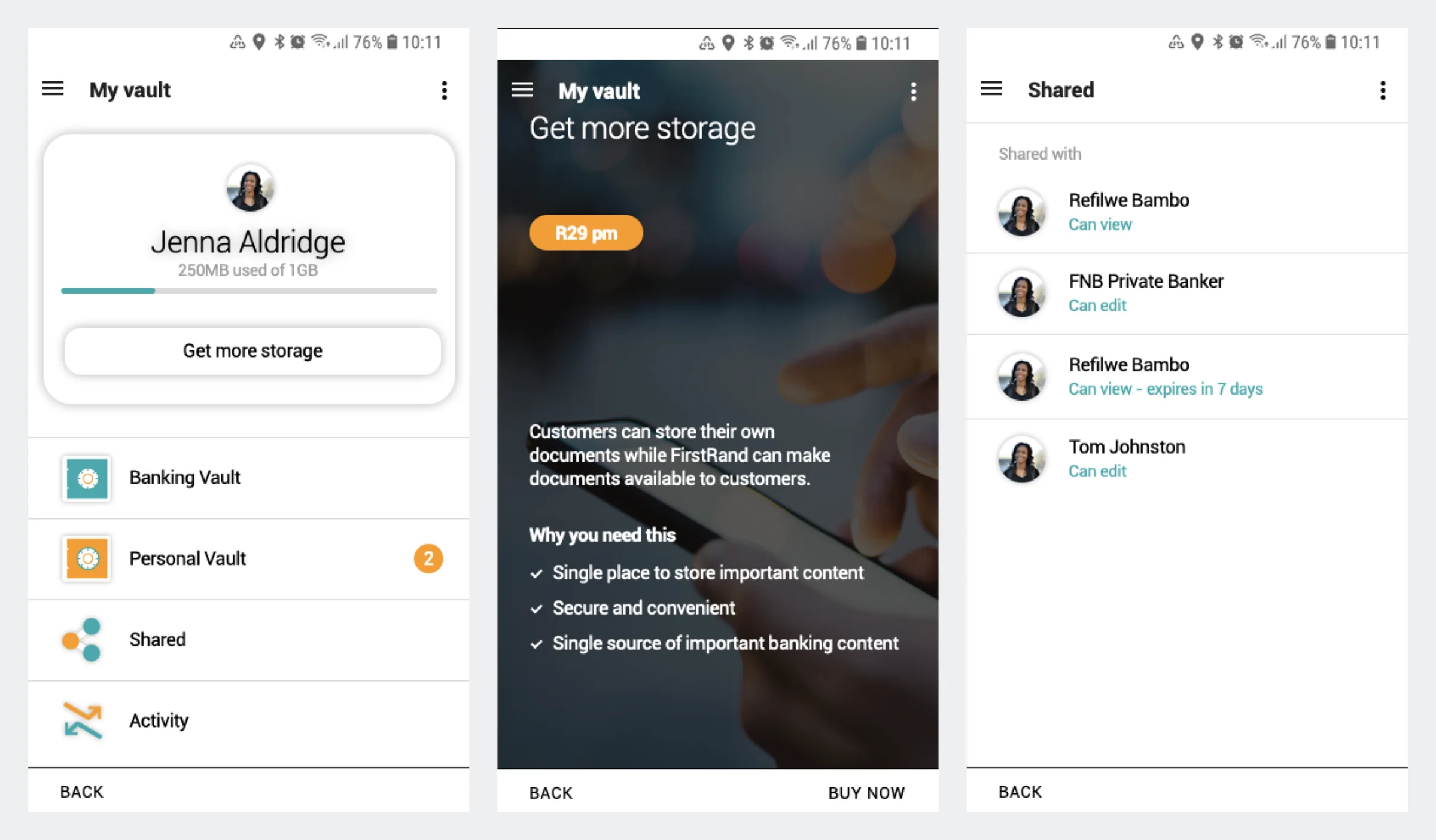
I designed the vault with sharing permissions and a paid storage tier. In testing, people hesitated to store personal documents with their bank, and colleagues said the same. I’ve never put mine in it either. Six years later at FNZ, I argued for documents on request instead, with no permissions model: the upload is the permission.
From the 2019 design file