Replica of the original
TLDR
FNB’s business customers met a worse bank than the one they used personally, built as if one person could pay alone. I led payments UX on the redesign: four payment workflows, each drawn twice, for whoever captures and whoever approves. It shipped countrywide between 2019 and 2020.
01
The problem
Business customers met a worse bank than the one they used personally.
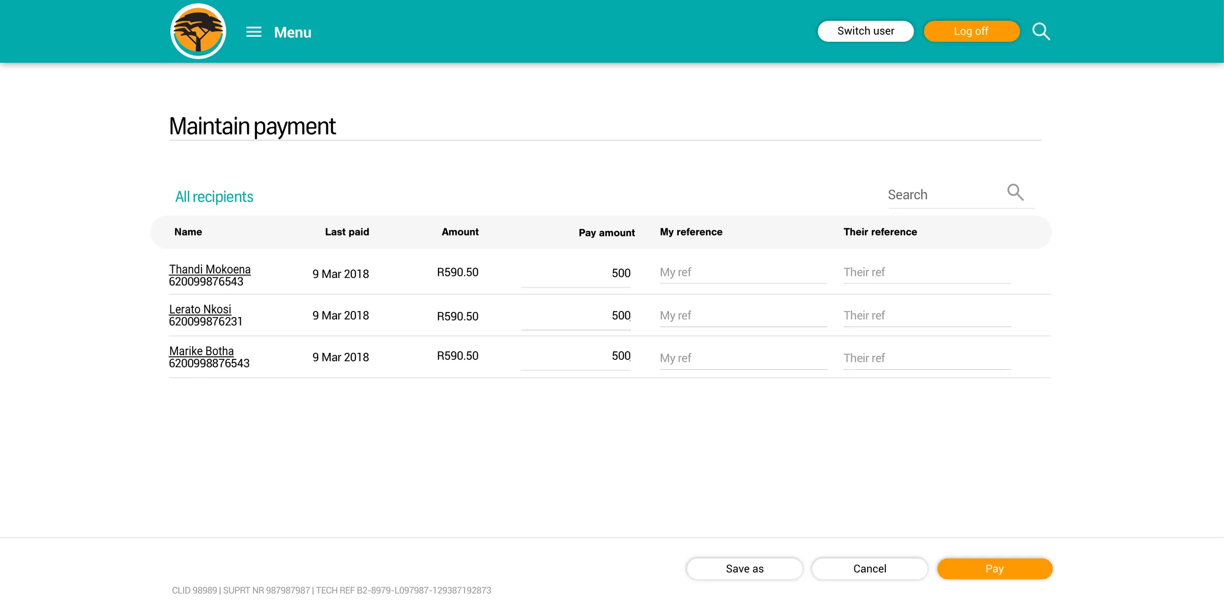
By 2018, business banking had drifted from the consumer app: different visual language, missing functions, little app parity. One customer called switching profiles clunky and confusing. Matching the consumer app looked like the fix, but it assumed one person could complete a payment alone. In many businesses, one person captures and another approves.
02
Two users
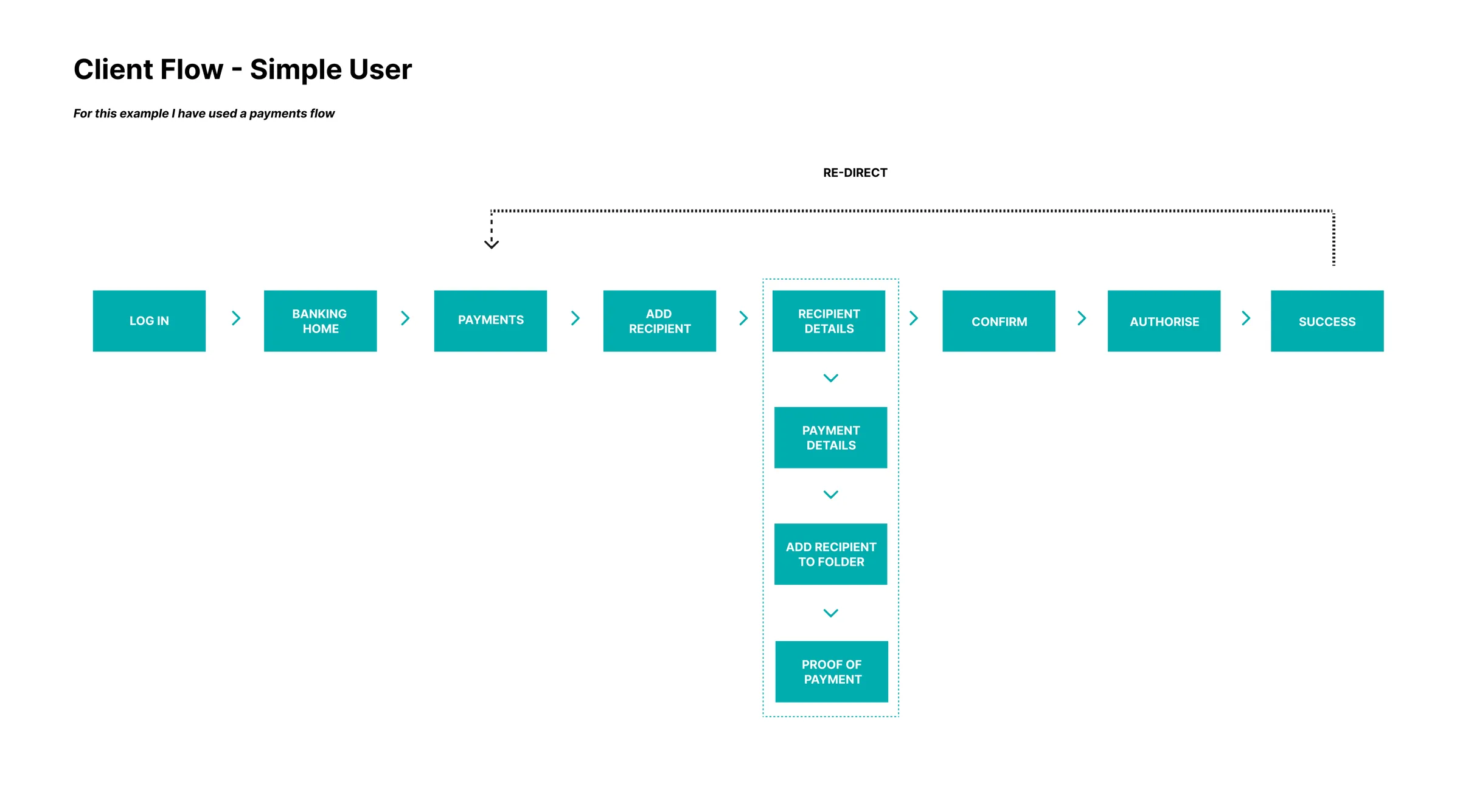
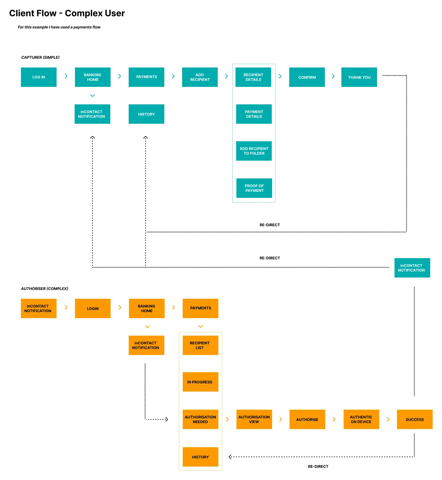
I drew every payment twice: once for someone who can do everything, once for two people who each do half.
A bank workshop exposed the distinction, and I defined the eight flows that answered it: recipient, folder, once-off and scheduled payments, each linear for full access and dual-track for capture and approval. FNB’s Capturer/Authoriser control already existed. The journeys had to carry it without either person doing extra work.
The decision
Business users don’t split by company size. They split by the entitlements already attached to their profile. So I drew the journeys against entitlement, not the org chart.
Replica of the original
03
Approval on a phone
Approval left the desk without loosening the control.
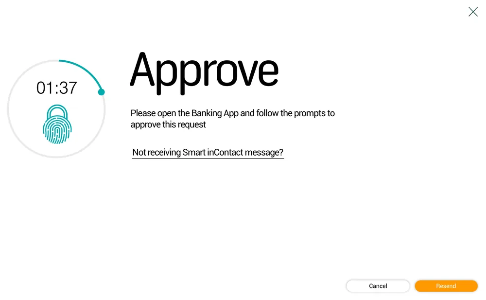
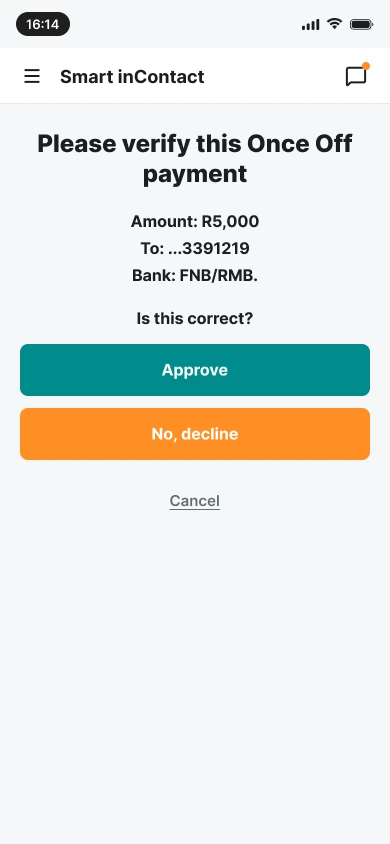
Authorisers had to log in on desktop to approve a payment. The brief moved approval to the phone, through Smart inContact, already proven on personal accounts. I designed the handoff: the desktop request waits on a countdown while the authoriser checks the amount, recipient and bank on their own phone, then approves or declines.
04
The rollout
Shipped countrywide over 23 months, and the entitlement framework outlasted it.
- 8payment flows
- 4workflows, drawn twice
- 23month rollout
A focus group first, then countrywide, January 2019 to November 2020. Former colleagues tell me the framework still shaped transactional design years after I left. I managed design pods and coached three junior designers. Nobody agreed how we’d know approvers were served well. Next time I’d track adoption and friction by user type from day one.